using perspective in a photo {photo tip}
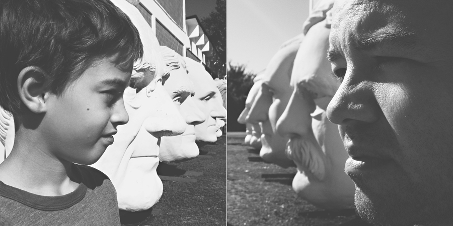
Yesterday I shared a picture of Chris’ head with several sculptures of presidential heads. Chris and I both attempted similar shots and our resulting pictures were very different. I’m going to pick on his shot today (with his permission) to share a little photo tip about using perspective in your photos.
Here are the final versions of our shots:
Chris’ shot ~ My shot
Now I want to walk through how to make a perspective shot work. I thought Chris could help me with this post too.
Here are our original images (these were shot with iPhones):
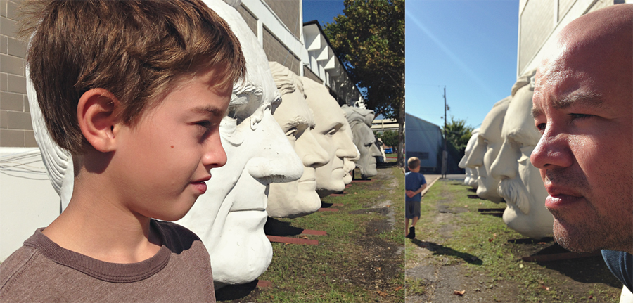
Chris: I just wanted to get my son in line with the presidents. I wasn’t thinking about composition at all. Were you thinking about anything else? Nope, I’m a dude. Well, I wanted to make sure you could see the other heads and it had good exposure. I was trying to get him on the far left.
Ashley: I knew what I wanted the end result of my image to look like (that I was going to covert to b&w and crop to a square); so I was not worried about the extra stuff in my original shot. I shot from an angle that I could use the lit areas and the shadows; and get more even exposure on the face & sculptures. I knew Chris’ face would have a darker exposure than the sculptures – so I wanted to shoot from an angle that minimized that difference instead of enhancing it.
When capturing our images, we used the sun in different ways. He shot from an angle where everything was very bright; he chose an angle that enhanced the brightness of the sculptures. Mistake number one. I’m kidding. Not really, but I am trying not to sound pompous!
Now when it came to lining up our subjects:
Chris: I was trying to line up all the noses.
Ashley: When I took my shot, I envisioned converging lines. I moved Chris around and changed my angle until I was able to get Chris close to lined up with those lines. I kept in mind that he would need to appear larger than the sculptures for more accurate perspective. He needed to be larger to blend in with the sculptures.
Do you remember back in school when you learned how to draw using perspective? Usually the art teacher would show you how to draw converging lines and demonstrate how objects closer to you are bigger than those in the distance. That same idea applies in photography. When Chris took his shot, he had our oldest stand where his nose lined up with the presidents instead of using the concept of converging lines.
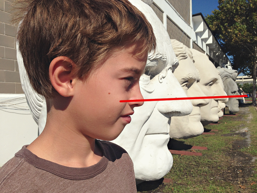
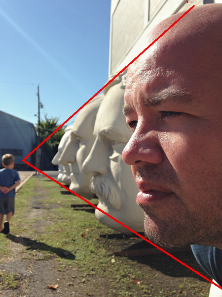
I knew I was going to crop my shot to a square so I didn’t worry about any extra stuff on the top, bottom or left sides of my image. Once we each took our shots, we cropped the images to squares. The presidents are made of concrete and my guys, obviously, are not. The contrast in skin color makes Chris and my son really stand out from the presidents. The goal of the photos was to make the guys blend in with the sculptures. By converting the images to black and white, the color no longer distracts from that goal.

So while we had the same goal for our photos and processed the photos the same, the difference is in how we shot the images. When you are going for an image that uses perspective like this, try to imagine converging lines and keep in mind that the object closest should usually be the largest.
Thanks Babe for letting me pick on you!
![]()
P.S. Emily is giving away a gift certificate to Meg’s shop (remember the cow canvas from the girls’ room tour & two spots in my next SnapShop: Phone course (January 2104). Click on the graphic to enter.


